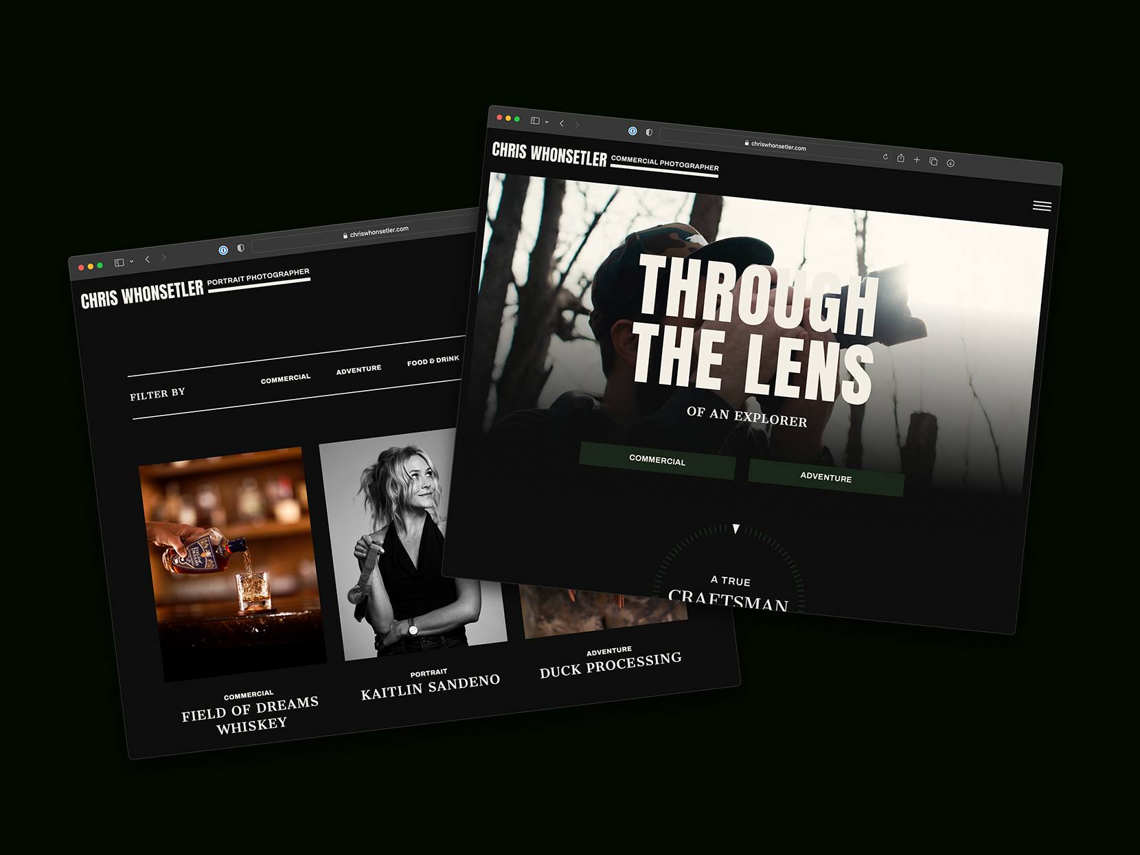
Indy Urban Acres

Client: No Mean City – NoMeanCity.com
Project: Photograph Indy Urban Acres for a featured blog post
Project Location: On Location – Indy Urban Acres
Photography Type: Documentary / Portrait
Execution: I almost peed my pants when No Mean City asked me to photography Indy Urban Acres! As a future homesteader and amateur gardener, I immediately jumped at the chance to walk around the farm and chat with the manager, Tyler Gough. Photography was a breeze! My only challenge was choosing a subject from the hundreds of species of flowers, vegetables, and animals on the property! My favorite was the black and white houdan chicken (second chicken pictured below with the afro).

If you have seen my homestead Instagram account (@sqftgrdn) you know how much I love showing off the beautiful (edible) things the earth provides us! Indy Urban Acres surpassed all of my expectations, from the bee hives and chickens to the eight acres of crops, all going back to local food banks! It is such a beautiful mission to give back to the community with what your community can grow!

Head over to No Mean City’s blog and read Homegrown Helpers, their blog post about Indy Urban Acres. Then call them and go volunteer! Life is better with a little dirt under your fingernails! :)

Sempose Fitness Portraits

Client: Sempose Fitness – SemposeFitness.com
Project: Staff Portraits for social media and marketing
Project Location: Studio
Photography Type: Portrait
Execution: We photographed Steve and Kelsey on a dark, moody background to match the Sempose Fitness website. I wanted their images to display both toughness and approachability. You don’t want a bunch of sissies training you do you?? On the other hand you don’t really want to be scared to death of your trainer! In the end I feel like the images we captured fit the vibes Sempose Fitness has to offer: a fun, but serious matchup to fit all of your personal training needs! 

McCall Dentures Staff Portraits & Office Architecture

Client: McCall Dentures – McCallDentures.com
Project: Staff Portraits & Office Architecture for website update
Project Location: On Location
Photography Type: Architecture & Portrait
Execution: On location photography of a brand new office and a beautiful staff is always a treat! We used their phenomenal waiting room as a backdrop for their staff portraits, which we converted into a digital group composite (Always need to leave room for growth!). Of course we photographed everything with strobes to get the best possible light on the staff and tethered to my laptop so every employee could see their photo instantly and approve it before they went back to work.
The Office architecture was all lit with strobes to help retain natural colors and reveal the textures of the space Natalie Troyer designed! Photographing a space is infinitely easier when it looks this good! You definitely need to send Natalie a note if you want your business or home to look this well designed! 

Wee Believers Lifestyle & E-Commerce Product

Client: Wee Believers – WeeBelievers.com
Project: Lifestyle images of product in use and images of products clipped out
Project Location: In Studio & On Location
Photography Type: Lifestyle / Product Imagery for Client Marketing
Execution: Working with children will always be entertaining! Being versatile enough to bring the studio to their environment made life infinity easier on this shoot. Breaking a child out of their shy phase and getting natural smiles and genuine interest in the product is truly a work of art. It’s a fine dance between getting them to listen to direction from the art director/photographer and letting their little, creative minds wander into pure child curiosity. The thing about working with children that is important to keep in mind is that we work at their pace. We switch gears when its nap time, we change out models if someone gets hungry or isn’t interested in the toy being photographed, we simply go with the flow. The minute you try to force a child to have fun, it blows up in your face, and crying is contagious! Working with children is equally hysterical and terrifying. These models were spectacular though! If every photoshoot went as smooth as this one I would photograph more infants! The only hurdle we faced was an overly loving model who was more interested in the boys on set than the product we needed her to hold! I consider this a win.


Living with Intention Team Portrait

Client: Living with Intention – livingwithintention.biz for Kit Magazine
Project: Staff group portrait
Project Location: Studio
Photography Type: Commercial Portrait for Client Marketing
Execution: Digital group composite so new staff members could be added at a later date. Much easier getting an amazing portrait of each individual that they loved in the group image with the added flexibility to modify the group image in the future without the need for everyone to come back to the studio at the same time.

WhonPhoto_LivingwithIntention_01 WhonPhoto_LivingwithIntention_02 WhonPhoto_LivingwithIntention_03WhonPhoto_LivingwithIntention_4

Headcase – IndyCar Driver Helmets for Pattern Magazine

In honor of race weekend I had to make this post. I had a super fun opportunity to photograph 8 IndyCar helmets for Pattern’s seventh issue! I’m in love the story behind each drivers design, sharing their heritage, family and partnerships. Text below by Kathy Kightlinger, featured in Pattern Issue No. 7.

Client: Pattern – PatternIndy.com 

Thanks to: IndyCar – IndyCar.com

Pippa Mann

Mann loves the clean lines of her helmet design – so much so that the look of her first helmet is similar to the one she has now, except the original was mostly blue. But, after her father said he couldn’t pick her out of a crowd on race day, she switched the primary color to red, so she would stand out. That red design, and the clean swooping lines, formed the basis for her logo and brand, which remained unchanged for almost a decade. In May 2014, Mann made a significant decision to exchange the red of her helmet for pink in support of Susan G. Komen. She doesn’t think she’ll ever make the switch back to red.


Marco Andretti

Andretti’s helmet reflects design elements from his family of racing royals, including his father Michael and his grandfather, Mario. Mario raced in a silver helmet with “Andretti” on its side. Then, when Viceroy became Mario’s sponsor, he added a red stripe on top of the helmet to match the brand’s packaging and added blue tips to it. When Marco began racing, he adopted Mario’s design with some changes made by Michael – an American flag along the cheeks – and swapped the red and blue colors on the top. Then, as another signature design element, Marco added a face stripe in 2013.


Tony Kanaan

When Tony Kanaan was a child, he wished for long, flowing hair that he could tuck behind his ears. Unfortunately, Kanaan’s hair was uncooperative. When he started go-karting, he cleverly solved his hairstyle problem by requesting a helmet design that emulated flowing locks. Today, Kanaan’s helmet design is essentially unchanged except for the color scheme and the addition of his son Leo’s actual handprints on the back of the helmet.


Helio Castroneves

Castroneves wore the “Yellow Submarine” helmet during the 2014 racing season. The iconic design was identical to the one worn by Indy 500 champ Rick Mears. Castroneves nearly joined Mears in the esteemed group of four-time Indianapolis 500 winners, but, after a thrilling race with Ryan Hunter-Reay in the closing laps, Hunter- Reay passed the checkered flag first.


Charlie Kimball

Kimball’s helmet design is based on that of Austrian Formula One driver Gerhard Berger, but it includes some patriotic twists. Kimball liked the geometry of the F1 driver’s helmet design, but when it came to the color scheme, Kimball incorporated red, white, and blue so his nationality was apparent when he raced in Europe.


Simon Pagenaud

The helmet Pagenaud wore in the 2014 Indy 500 celebrates the life of his hero, iconic three-time Formula One Champion Ayrton Senna. Its design is a unique blend of Senna’s and Pagenaud’s trademark red schemes. In late 2014, Pagenaud auctioned the race-worn helmet for charity, raising $12,300 for the Ayrton Senna Institute benefiting children’s literacy in Brazil.


Will Power

A proud native of Toowoomba, Australia, 2014 Verizon IndyCar Series champion Will Power displays the Australian flag prominently on his helmet. Power became the first Australian to win a major international motorsports title since 1980.


Josef Newgarden

Unlike a lot of drivers, Newgarden’s helmet design is ever-changing. California-based helmet designer Brett King is a friend of Newgarden’s so they work together to create new looks. Newgarden does have one ever- present design element – the initials and birthdates of his car’s mechanics. He says he proudly wears the markings so he has everyone in the car with him when he races.


450 North Brewing Co

Project Details: Capturing new can design for portfolio usage.

Clients: CODO Design & 450 North Brewing

Assistant: Elese Hacker

Thoughts: After photographing the overall design on each of the four cans we decided to have some fun with the Scarecrow IPA and created an action pouring shot. Once winter hits in full force and business slows down a bit we will photograph the remaining 3 cans to complete the pouring set.

This slideshow requires JavaScript.